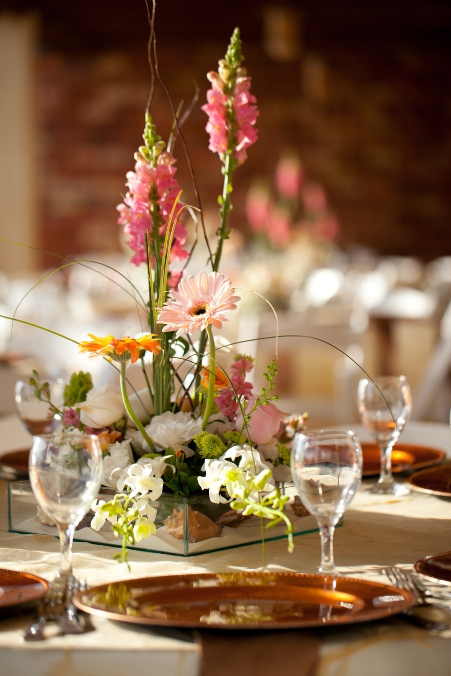
In a prior article, we talked about how to ensure your restaurant has the “wow” factor necessary to not only attract customers, but keep them coming back for more. Everything from the demeanor of your wait staff to the menu and decor are key features your guests will take note of. Knowing this, it makes sense to carefully research what color palette suits your restaurant and best conveys the mood you want for your guests.
Based on more than 20 years experience, Roger Beaudoin provides industry-leading restaurant consulting services, and if you’re considering your own startup, Restaurant Rockstars is a vital addition to your toolkit. Check out our podcasts and then shop our downloads to learn more! In the meantime, check out some common color schemes for restaurant decor and how they can impact guests!
Bright, Bold Schemes
When thinking about fast food restaurants, we often imagine bright reds, yellows, oranges, and greens. It’s not surprising to find these colors in quick-serve restaurants since they tend to raise heart rates and blood pressure while making patrons feel rushed. As such, these colors are best suited for restaurants who desire a quick dining experience for guests.
Dark, Rich Colors
Deep colors such as navy, burgundy, and charcoal can make a large room feel smaller and more intimate. Darker color schemes may be better suited for larger dining halls when you want to create a rich and close feeling among your guests. Darker color schemes can be tricky, though, because you don’t want your guests to feel depressed or claustrophobic, so choose wisely!
Warm, Welcoming Hues
If your ultimate goal is guest comfort and relaxation, warm colors like romantic reds or comforting yellows and oranges may be just the ticket for your space. Especially when paired with lighting that’s not too stark, your guests will feel like they can kick back and unwind from a long day while surrounded in your warm and welcoming space.
Light, Soft Colors
Choosing a light color scheme for your restaurant can make a smaller space seem bigger, and a larger space feel open and airy. Colors like beige, off-white, light yellows, and pale grays will make your guests feel comfortable, which means they may stay longer to order dessert. Many people in the restaurant consulting industry feel that light color schemes are best for high-end restaurants.
Cool, Airy Tones
While certain shades of blue, green, and some metallics can lend themselves to relaxation and restfulness, you may want to steer clear of cool colors as the main theme of your restaurant. Blue has been documented in studies as an appetite-suppressing color that lends itself to making patrons feel thirsty. As such, these cool and airy tones are best left to accents.
Choosing the right color scheme for your restaurant is integral to your guests’ mood and experience. For more tips and restaurant consulting information, browse our articles, then be sure to contact us to learn more about how Restaurant Rockstars can help you ROCK your business!


